
︎︎︎
1. Introduction:
Transforming the Commute
Transforming the Commute
For many, public transit comes with its share of stress, from keeping track of unfamiliar stops to finding the fastest way through the daily rush. This app aims to ease these challenges by providing timely alerts and smart route adjustments, helping riders navigate their commute with confidence and efficiency, no matter where they’re headed.
This case study seeks to address the pressing question: How might we create a solution that makes public transit less disorientating, guiding commuters with timely notifications and route options to ensure they reach their destination smoothly and efficiently?
︎︎︎
2. Define
Meet the Clients
Our design process centers on real clients with distinct commuting needs and challenges. These individuals serve as direct users in our user-centered design journey, allowing us to tailor solutions that address specific, real-world transit frustrations. Their experiences and insights drive our design decisions, making sure the app is both practical and useful.

Tardy Tommy - The Platform Runner
Age: 23
Occupation: Student, Photographer, Advertising & Branding Intern.
Location: Jersey City (Residence) and New York City (School).
Hobbies: Photography, Motor Racing, Basketball.
︎ Pain Points:
Age: 23
Occupation: Student, Photographer, Advertising & Branding Intern.
Location: Jersey City (Residence) and New York City (School).
Hobbies: Photography, Motor Racing, Basketball.
︎ Pain Points:
- Although Tommy commutes between cities everyday and knows the train routes by heart, it’s still difficult for him to know which route is the fastest among many.
“I can take the A or C, sometimes R comes earlier but the 4,5 takes me there the fastest.”
- Tommy’s an night owl. He has trouble waking up for his classes, which often makes him having to rush through his commute.

Giddy Gabrielle - The Out-of-Towner
Age: 19
Occupation: Student
Location: Upstate NY, but visits NYC occasionally.
Hobbies: Fashion, Modern Arts.
︎ Pain Points:
Age: 19
Occupation: Student
Location: Upstate NY, but visits NYC occasionally.
Hobbies: Fashion, Modern Arts.
︎ Pain Points:
- Unfamiliar with the New York City subway system. She misses her stops frequently on her visits here, due to the absence of interactive maps on the trains and the inaudibility of passenger announcements.
- To make her transit simpler, she sacrifices any oppurtunities of a faster route, such as: switching to an express train.
The Target User Group.
Our app targets NYC commuters who navigate the city’s complex, bustling transit system. From daily riders to occasional visitors. These users are students, young professionals, and travelers trying to stay on time. They face challenges like missed stops, crowded platforms, inaudible announcements, and figuring out the fastest route among multiple options.
Our goal is to provide them with real-time guidance and route recommendations, transforming their NYC commute into a smoother, more manageable experience.
︎︎︎
3. Research
Through the Competitive Landscape
Similar products, like Google Maps and the NYC Transit app, provide basic get-off alerts and some level of step-by-step guidance. However, these apps often lack the detailed, incremental actions that can make navigation more intuitive for users unfamiliar with the transit system. Additionally, they do not offer real-time route switching. This gap in functionality leaves an opportunity for a more better solution.
GPS Tracking
Get-off Alerts
Step-by-step Guide
Route Switching

Google Maps
︎
︎
︎
︎

NYC Transit
︎
︎
︎
︎

MTA App
︎
︎
︎
︎
︎︎︎
4. Design
Commute with Confidence: Flying Lap
With Flying Lap, navigating NYC’s transit becomes effortless. Designed for commuters who need clear guidance or faster alternatives, Flying Lap offers get-off alerts and real-time route switching. This intuitive and adaptive app helps riders stay on track and reach their destination smoothly.
The name “Flying Lap” originates from one of the client’s passion in motor racing. It means a round on the circuit where the racer strives to makes their fastest record.


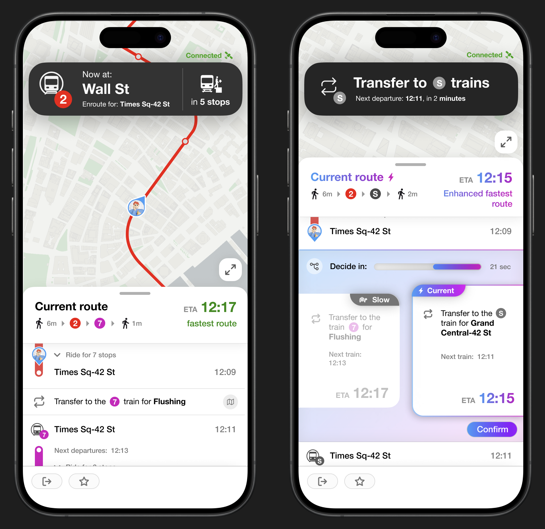
1.
The initial route selection screen offers the user with choices of routes. When selected, the choice tab expands to show a graph that shows the lastest leaving time.
2.
When enroute, a banner at the top shows the next immediate action, and the bottom section shows the overall progress of the commute.By clicking the expand icon, the map view becomes a route-map view. The route details are now in fullscreen.

A question to ask:
“How does the app track underground, where has no signal?”
Although the precise position cannot be tracked, it’s still possible to know where the user is at in general. When the signal is out, we know that the user has likely departed the stop, and when the signal is back on, we know that the user has likely reached the next stop, which can be further verified by precise tracking when the device is connected.

3.
When reaching a transfer point, the banner prompts the user to exit the train and transfer.
4.
If a faster route is available, the interface prompts the user to choose through a call-to-action.
5.
The arrival summary.
6.
Share your record. By clicking the share button in step 5, the user gets a sharable image of their commute summary.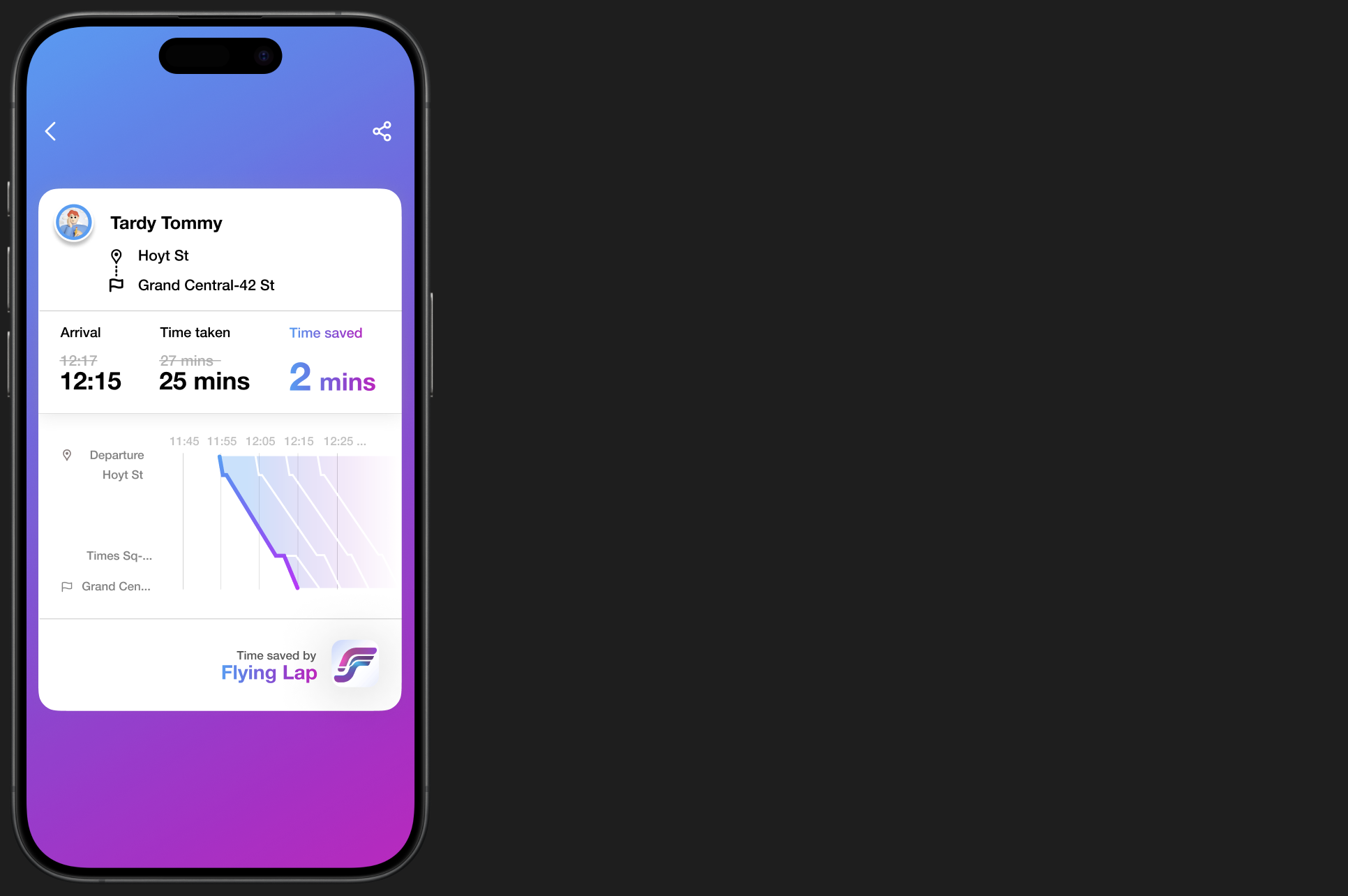
︎︎︎